


Share this
The 5 most common mistakes when offering an online ordering service


The 5 most common mistakes when launching an online ordering service.
Read about these commons mistakes and increase your sales today.
Lots of our customers have requested us that we give them tips on how to increase their sales when they have launched their online ordering website. For those in our audience, who do not know what ordering.co does I will just explain it very shortly.
Ordering.co is a multi-store platform with native mobile Apps for Online Ordering and Drivers. We have been offering technology for lots of companies around the world since 2012, and we have seen a lot of mistakes, but there are the most common ones.
Around 85% of our customers (From over 20 different countries around the globe) are new companies (startups) which are starting in the on-demand delivery branch. That means they offer a website on which the users can check who delivers a particular kind of product to their home. In our case, most of our customers are working with restaurants, so their users come to their platforms, and they are looking to place an order online because they are feeling hungry.
Now that we have explained this let’s go and talk about the five most common mistakes that we have seen people commit in this branch:
Mistake #5 Not having a serious, informative and helpful contact us page
I think every one of us that have placed an order online has had a problem with the order for some reason, right? This conflict will take you to the next step. What to do in the case that you need to ask something about your order, modify anything on it or if you need to cancel it? Look for a link or page that can help you!
Users will typically look for a page that is called „Contact us“ because they know that is the section of your site that can help you to get in touch with the service provider.
Having a simple form where you ask the user for his name, e-mail and content of the message are not going to make your user happy if you do not give some extra information. Users were coming to this page feeling already frustrated because of the problem and finding out they can just fill a form and hope that someone gets back to them will kill your chance that they order again on your website. You will not get a good review about that.
Here is the advice that I would like to give you about this.
Create a good contact us page with the following elements:
Message before the contact form indicating that is the response time according to each topic.
Mention who is the person or persons that will take care of this
DO NOT use generic images from google to show happy people. This is just cheap, nobody believes it, and it makes you look unprofessional.
Include your business address
Include your phone number EVEN if you do not offer support service per phone. You can indicate this written on the top of the number. For the users knowing that you are a business that is not hiding to be contacted gives them a feeling that everything will be ok.
ANSWER to the requests as fast as possible. It does not matter that you inform everything correctly if you do not answer the request of your users, so please be sure your agents will answer to the user as soon as possible.
Use an auto-respond to send a confirmation to the email of the user. The user will be well informed about then you are going to answer, and he can be sure that you have his message.
Include REAL testimonial of another user who tells about this experience with the support of your site.
With this, the image of your company will be better when the users have problems with their orders or when they have found an issue on the site.
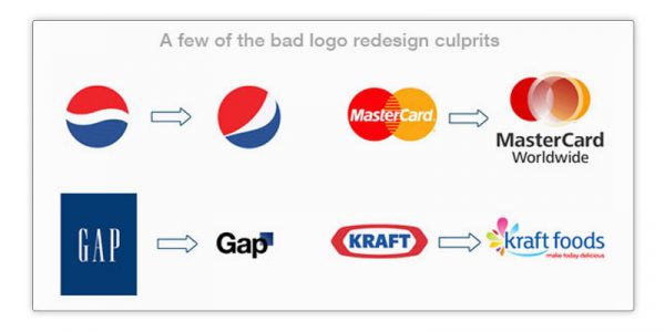
Mistake #4 Having A Bad Looking Logo
If you have a great logo and you are wondering if people do not pay attention to this, my answers are YES. It is very disappointing for us providers to see that our customers have invested lots of time and money setting up their business and to see the horrible logo when visiting the website for the first time. People use very often horrible looking logos which look bad for the following reasons:
It looks like 11-year old child did it with Paint on Windows 95
It is very bad in resolution (showing pixels) because you have NOT optimized the file with the right tools
The logo looks like it was done in the 80´s but it does not fit the new trends for logos of 2017
Users need to know that your service and platform is of high quality because that is automatically what they will expect of your service. If your logo, something really basic, does not look great a user can not expect that the experience of ordering on your platform is good.
Details are important. Your logo is a basic component of your public image, and that is why you have to invest time and money in making it look great.
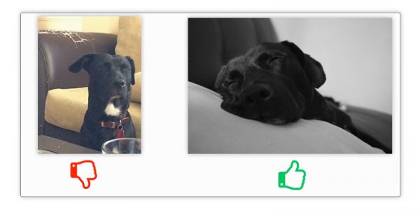
Mistake #3 Using Bad Quality Images as a Background of your Platform & Using Bad Quality Images as Product Images
The looks are significant for any user. A vital part of converting a visitor into a customer is making him fall in love with the product that you sell.
Yes, we know that the user is already visiting the website with a specific wish and idea in this head. In the case of most of our customers, the visitor comes to the website because he is feeling hungry and he would like to order something. He probably already knows which type of food he wants to order and he also has an approximate image of this good in his head.
So to say you have already won the battle before starting, so all you have to do is to do nothing wrong. About this topic, doing something wrong would be having a very cheap background on your homepage. If the image is not looking classy, nice and qualitative, the user is going to start having second thoughts about using your service and placing an order on your platform.
Let´s say the visitor has done it through the homepage and now he is looking at the listing of your platform. He is probably thinking „Mmm… Which restaurant looks good“ or „Mmm… where is the restaurant that I like“ if at this moment your listing is looking very cheap because you did not take the time to upload the right sizes of the logos for each store the user will start doubting again? It essential that the logos and description of each store are well done. This is the presentation card of the portfolio that you are handling. I know it is sometimes not easy to have
Mistake #2 Not having a live chat available at the busiest times of the day
This topic has been crucial for all of our customers. Many of them underestimate the positive influence that a live chat service on your website can have. The fact that you can interact with your visitor to solve a specific question can turn a visitor into a customer.
Nowadays we all think it is pretty obvious how the process for online ordering is but people have specific questions very often and by only creating a FAQ or a contact us page sometimes it is just not enough to make your visitor feel safe.
People like confirming what they think they know. Live chats can help your visitors reach this goal. Let me give you some examples:
-Hello! I saw that I could pay with PayPal is that correct?
-Hello, welcome, yes, you can pay in some of the restaurants with Paypal
-Oh, only some at some of them?
-Yes, that is correct.
-What about the restaurant „X.“
-Let me check that for you, hold, please
-Thanks!
-Yes, you can pay with Paypal at restaurant X
-Great, I will order now
As we can see in this example people as apparent things that they could have found themselves when using the online ordering platform but having a live chat agent to confirm this has made it clear once again. The visitors feel better because of this certainty and places the order.

GET A LIVECHAT HERE
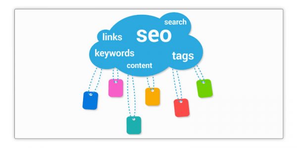
Mistake #1 Bringing the wrong traffic to your website and not investing in SEO
Search engine optimization has been a huge topic for the last years, and there is a reason for it. It can change the future of your company. The great thing about being on the right side of search engine optimization is that you can get the correct people with the proper needs to your site, which is supposed to offer the right products or services to them.
It is essential that you invest time in the know a little bit about SEO. If you do have the opportunity to learn about the most simple practices, then I strongly recommend getting an SEO agency to do this for you.
Search engines will always give you the cheapest rate in money for each visitor. With paid campaigns, you would need to invest many thousands of dollars to get the same results. The good thing about SEO is that it is a good investment in the long term once the optimization is done there is little chance the things go very wrong. Now let me give you some advice how to choose some right keywords when you talk to your SEO agency.
Topics:
Solutions and Use Cases
Share this
- May 2026 (11)
- April 2026 (1)
- March 2026 (1)
- February 2026 (5)
- January 2026 (12)
- December 2025 (7)
- November 2025 (1)
- October 2025 (4)
- September 2025 (10)
- August 2025 (10)
- July 2025 (7)
- June 2025 (9)
- February 2025 (1)
- January 2025 (2)
- December 2024 (2)
- April 2024 (1)
- January 2024 (1)
- December 2023 (3)
- November 2023 (15)
- May 2023 (21)
- April 2023 (8)
- March 2023 (5)
- February 2023 (67)
- January 2023 (156)
- July 2022 (20)
- June 2022 (60)
- April 2022 (2)
- February 2022 (17)
- January 2022 (26)
- December 2021 (15)
- November 2021 (9)
- October 2021 (1)
- June 2021 (1)
- May 2021 (3)
- March 2021 (5)
- February 2021 (5)
- November 2020 (5)
- October 2020 (1)
- September 2020 (2)
- July 2020 (1)
- February 2020 (1)
- May 2019 (3)
- April 2019 (3)
- March 2019 (1)
- January 2019 (11)
- November 2018 (1)
- September 2018 (4)
- August 2018 (4)
- July 2018 (6)
- June 2018 (4)
- May 2018 (18)
- April 2018 (10)
- March 2018 (9)
- February 2018 (14)
- January 2018 (19)
- December 2017 (10)
- November 2017 (10)
- October 2017 (18)
- September 2017 (12)
- August 2017 (17)
- July 2017 (5)
- June 2017 (6)
- May 2017 (2)
- January 2017 (1)